This article describes mechanisms for asynchronous collaboration in the context of information visualization, recasting visualizations as not just analytic tools, but social spaces. We contribute the design and implementation of sense.us, a Web site supporting asynchronous collaboration across a variety of visualization types. The site supports view sharing, discussion, graphical annotation, and social navigation and includes novel interaction elements. We report the results of user studies of the system, observing emergent patterns of social data analysis, including cycles of observation and hypothesis, and the complementary roles of social navigation and data-driven exploration.
1. Introduction
Visual representations of information often lead to new insights by enabling viewers to see data in context, observe patterns, and make comparisons. In this way, visualizations leverage the human visual system to improve our ability to process large amounts of data. Card et al.6 describe how visualization supports the process of sensemaking, in which information is collected, organized, and analyzed to form new knowledge and inform further action. They emphasize the ways visualization exploits an individual’s visual perception to facilitate cognition.
In practice, however, sensemaking is often also a social process. People may disagree on how to interpret the data and may contribute contextual knowledge that deepens understanding. As participants build consensus or make decisions they learn from their peers. Furthermore, some data sets are so large that thorough exploration by a single person is unlikely. This suggests that to fully support sensemaking, visualizations should also support social interaction. In this spirit, a recent report23 names the design of collaborative visualization tools as a grand challenge for visualization research.
These considerations are not just hypothetical. For example, the manager of a business group in our company described to us how quarterly reports are disseminated within his organization via e-mail. Heated discussion takes place around charts and graphs as the group debates the causes of sales trends and considers possible future actions. However, writing about particular trends or views is difficult, involving awkward references to attached spreadsheets from the e-mail text. Furthermore, the discussion is scattered and disconnected from the visualizations, making it difficult for newcomers to catch up or others to review and summarize the discussion thus far. According to the manager of the group, the analysis process could benefit from a system for sharing, annotating, and discussing the visualized data.
Similar scenarios appear in other domains. Moreover, experiences with deployments of visualizations hint at ways that social phenomena already occur around visualizations. Wattenberg and Kriss27 describe the response to NameVoyager, an online visualization of historical baby name trends. Playful yet often surprisingly deep analysis appeared on numerous blogs as participants discussed their insights and hypotheses. Observing the use of a physical installation of the Vizster social network visualization, Heer18 noted that groups of users, spurred by storytelling of shared memories, spent more time exploring and asked deeper analysis questions than individuals. Similarly, Viégas et al.24 found that users of the PostHistory e-mail archive visualization immediately wanted to share views with friends and family and engage in storytelling.
While suggestive, these observations provide only a circumstantial understanding of the social aspects of asynchronous analysis around visualizations. In the case of the NameVoyager and PostHistory, the findings were essentially accidental. Vizster was designed for playful interaction, but in a synchronous and less analytic context. It would therefore be valuable to replicate these findings to deepen our understanding of this type of interaction.
Furthermore, if social interaction is an important accompaniment to data visualization, it is natural to look for ways to support and encourage it. To address both these goals, we designed and implemented a Web site, sense.us, aimed at group exploration of demographic data. The site provides a suite of interactive visualizations and facilitates collaboration through view bookmarking, doubly linked discussions, graphical annotation, saved bookmark trails, and social navigation through comment listings and user profiles. We then conducted user studies to observe closely how people engage in social data analysis. The studies also allowed us to evaluate the new design elements in the site and suggest directions for future work.
2. Prior Work
Collaboration has been well studied in contexts that are not directly related to information visualization. The study of how computer systems can enable collaboration is referred to as computer-supported cooperative work, or CSCW. Because collaboration occurs in a variety of situations, CSCW scholars often use a “time-space” matrix21 to outline the conceptual landscape. The time dimension represents whether or not participants interact at the same time (synchronously or asynchronously)—for example, instant messaging is a largely synchronous communication medium, while e-mail is asynchronous. The space dimension describes whether users are collocated or geographically distributed.
Most work on collaborative visualization has been done in the context of synchronous scenarios: users interacting at the same time to analyze scientific results or discuss the state of a battlefield. Collocated collaboration usually involves shared displays, including wall-sized, table-top, or virtual reality displays (e.g., Dietz,14 General Dynamics16). Systems supporting remote collaboration have primarily focused on synchronous interaction,1, 4 such as shared virtual workspaces8 and augmented reality systems that enable multiple users to interact concurrently with visualized data.3,9 In addition, the availability of public displays has prompted researchers to experiment with asynchronous, collocated visualization (same place, different time), for example, in the form of ambient displays that share activity information about collocated users.7
In this article, we focus on remote asynchronous collaboration—the kind of collaboration that is most common over the Web. One reason for our interest is that partitioning work across both time and space holds the potential of greater scalability in group-oriented analysis. For example, one decision-making study found that asynchronous collaboration resulted in higher-quality outcomes—broader discussions, more complete reports, and longer solutions—than face-to-face collaboration.2 However, as noted by Viégas and Wattenberg,25 little research attention has been dedicated to asynchronous collaboration around interactive visualization. Instead, users often rely on static imagery when communicating about these interactive systems. Images of the visualization are transferred as printouts or Screenshots, or included in word-processing or presentation documents.
A few commercial visualization systems introduced prior to our work provide asynchronous collaboration features. Online mapping systems (e.g., Google Maps) provide bookmarks (URLs) that users can send to others to share views. The visualization company Spotfire provides DecisionSite Posters, a Web-based system that allows a user to post an interactive visualization view that other users can explore and comment on. The Posters apply only to a subset of Spotfire’s full functionality and do not allow graphical annotations, limiting their adoption.25
One common feature of these systems is application bookmarks: URLs or URL-like objects that point back into a particular state of the application, for example, a location and zoom level in the case of Google Maps. This pattern is not surprising; for users to collaborate, they must be able to share what they are seeing to establish a common ground for conversation.12
One of the primary uses of bookmarks is in discussion forums surrounding a visualization. Some systems use what we term independent discussion, where conversations are decoupled from the visualization. For example, Google Earth provides threaded discussion forums with messages that include bookmarks into the visualized globe. In such systems there are unidirectional links from the discussion to the visualization, but no way to discover related comments while navigating the visualization itself.
Another stream of related work comes from wholly or partly visual annotation systems, such as the regional annotations in sites such as Flickr.com and Wikimapia.org and in Churchill et al.’s anchored conversations.10 Such systems enable embedded discussion that places conversational markers directly within a visualization or document. Discussion of a specific item may be accessed through a linked annotation shown within the visualization. These systems may be seen as the converse of independent discussions, allowing unidirectional links from an artifact to commentary.
In this article, we extend the past work with a comprehensive design for asynchronous collaboration around interactive data visualizations, addressing issues of view sharing, discussion, graphical annotation, and social navigation.
3. The Design of Sense.US
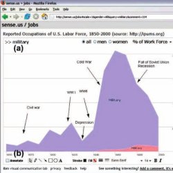
To explore the possibilities for asynchronous collaborative visualization, we designed and implemented sense.us, a prototype Web application for social visual data analysis. The site provides a suite of visualizations of United States census data over the last 150 years (see Figures 1 and 2) and was designed for use by a general audience. We built sense, us to put our design hypotheses into a concrete form which we could then deploy and use to study collaborative data exploration.
The primary interface for sense.us is shown in Figure 1. In the left panel is a Java applet containing a visualization. The right panel provides a discussion area, displaying commentary associated with the current visualization view, and a graphical bookmark trail, providing access to views bookmarked by the user. With a straightforward bookmarking mechanism, sense.us supports collaboration with features described in detail below: doubly linked discussions, graphical annotations, saved bookmark trails, and social navigation via comment listings and user activity profiles.
When collaborating around visualizations, participants must be able to see the same visual environment in order to ground12 each others’ actions and comments. To this aim, the sense.us site provides a mechanism for bookmarking views. The system makes application bookmarking transparent by tying it to conventional Web bookmarking. The browser’s location bar always displays a URL that links to the current state of the visualization, defined by the settings of filtering, navigation, and visual encoding parameters. As the visualization view changes, the URL updates to reflect the current state (Figure 1f), simplifying the process of sharing a view through e-mail, blogs, or instant messaging by enabling users to cut-and-paste a link to the current view at any time. To conform to user expectations, the browser’s back and forward buttons are tied to the visualization state, allowing easy navigation to previously seen views.
To situate conversation around the visualization, we created a technique called doubly linked discussion. The method begins with an “independent” discussion interface in which users can attach comments to particular states (or views) of a visualization. Comments are shown on the right side of the Web page and grouped into linear discussion threads (Figure 1e). Each comment shows the thread topic, comment text, the author’s full name, and the time at which the comment was authored. Clicking on a comment takes the visualization to a bookmarked state representing the view seen by the comment’s author.
Users can add comments either by starting a new thread or posting a reply to an existing thread. When a “New Comment” or “Reply” link is clicked, a text editor appears at the site where the comment will be inserted and the graphical annotation tools (discussed next) become active. Upon submission, the comment text and any annotations are sent to the server and the comment listing is updated.
The interface described above is based on links from the commentary into the visualization. Our system also provides links in the other direction: from the visualization into the discussion. As a user changes parameters and views in the visualization, they may serendipitously happen upon a view that another person has already commented on. When this occurs, the relevant comments will automatically appear in the right-hand pane. Our intuition was that this “doubly linked” discussion interface, which combines aspects of independent and embedded discussion, would facilitate grounding and enable the visualization itself to become a social place.
 3.3. Pointing via graphical annotation
In real-time collocated collaboration, participants commonly use both speech and gesture, particularly pointing,11,20 to refer to objects and direct conversation. For asynchronous collaboration, graphical annotations can play a similar communicative role. We hypothesized that graphical annotations would be important both for pointing behavior and playful commentary. To add a pictorial element to a comment or point to a feature of interest, authors can use drawing tools (Figure 1b) to annotate the commented view. These tools allow free-form ink, lines, arrows, shapes, and text to be drawn over the visualization view. The tools are similar to presentation tools such as Microsoft PowerPoint and are intended to leverage users’ familiarity with such systems.
Comments with annotations are indicated by the presence of a small shape logo to the left of the author’s name in the comment listing (see Figure 1e). When the mouse hovers over an annotated comment, the comment region highlights in yellow and a hand cursor appears. Subsequently clicking the region causes the annotation to be shown and the highlighting to darken and become permanent. Clicking the comment again (or clicking a different comment) will remove the current annotation and highlighting.
We refer to this approach as geometric annotation, which operates like an “acetate layer” over the visualization, in contrast to data-aware annotations directly associated with the underlying data. We chose to implement a free-form annotation mechanism so that we could first study pointing behaviors in an unconstrained medium. Aside from the freedom of expression it affords, geometric annotation also has a technical advantage: it allows reuse of the identical annotation system across visualizations, easing implementation and preserving a consistent user experience.
3.4. Collecting and linking views
In data analysis it is common to make comparisons between different ways of looking at data. Furthermore, storytelling has been suggested to play an important role in social usage of visualizations, as discussed by Viégas et al.24 Drawing comparisons and telling stories both require the ability to embed multiple view bookmarks into a single comment.
To support such multiview comments and narratives, we created a “bookmark trail” widget. The bookmark trail functions something like a shopping cart: as a user navigates through the site, he or she can click a special “Add View” link to add the current view to a graphical list of bookmarks (Figure 1c). Bookmarks from any number of visualizations can be added to a trail. A trail may be named and saved, making it accessible to others.
The bookmark trail widget also functions as a short-term storage mechanism when making a comment that includes links to multiple views. Dragging a thumbnail from the bookmark trail and dropping it onto the text area create a hyperlink to the bookmarked view; users can then directly edit or delete the link text within the text editor. When the mouse hovers over the link text, a tooltip thumbnail of the linked view is shown.
3.5. Awareness and social navigation
Social navigation15 leverages usage history to provide additional navigation options within an information space. Our initial system supports social navigation through comment listings and user profile pages that display recent activity. Comment listings provide a searchable and sortable collection of all comments made within the system, and can be filtered to focus on a single visualization (see Figure 3). Comment listing pages include the text and a thumbnail image of the visualization state for each comment. Hovering over the thumbnail yields a tooltip with a larger image. Clicking a comment link takes the user to the state of the visualization where the comment was made, displaying any annotations included with the comment. The author’s name links to the author’s profile page, which includes their five most recent comment threads and five most recently saved bookmark trails. The view also notes the number of comments made on a thread since the user’s last comment, allowing users to monitor the activity of discussions to which they contribute.
Although more elaborate social navigation mechanisms are possible, we wanted to observe system usage with just these basic options. We were particularly interested in observing the potential interplay between data-driven exploration and social navigation. By allowing discussions to be retrieved unobtrusively while a user explores the data, potentially relevant conversation can be introduced into the exploration process. Meanwhile, comment listings and indications of recent posts may help users find views of interest, making social activity a catalyst for data exploration.
3.6. Unobtrusive collaboration
Finally, while designing sense.us we also wished to follow a common CSCW design guideline: collaborative features should not impede individual usage.17 Hence we did not litter views with prior annotations or commentary. Rather, commentary on a visualization is retrieved and displayed unobtrusively on the right side of the screen and graphical annotations are displayed “on demand” by the user.
4. Implementation Notes
While many aspects of sense.us rely on well-known techniques, this section provides implementation details for the more complex features: application bookmarking, doubly linked discussions, and graphical annotations.
Bookmarks of visualization state are implemented as a set of namevalue pairs of visualization parameters, listed using standard URL query syntax. Normally, changing the browser’s URL will force a reload of the page to prevent security attacks. Because a reload would cause a disruptive restart of the visualization applet, the bookmark URL encodes the query string as a page anchor—using the URL ‘#’ delimiter instead of the standard ‘?’ delimiter—so that the URL updates in place. Furthermore, updated URLs are put into the browser’s history stack, so that the browser’s back and forward buttons have their usual behavior. When a visualization URL is updated due to use of the back or forward buttons or manual typing, scripts send the updated URL to the applet, which is parsed and used to update the current visualization state.
4.2. Doubly linked discussions
The bookmarking mechanisms alone are not sufficient to support doubly linked discussions. To see the challenge in linking from a view state back to all comments on that view, consider the visualization in Figure 1. When a user types “military” into the top search box, they see all jobs whose titles begin with the string “military.” On the other hand, if they type only “mili,” they see all titles beginning with “mili”—but this turns out to be the identical set of jobs. These different parameter settings result in different URLs, and yet provide exactly the same visualization view. More generally, parameter settings may not have a one-to-one mapping to visualization states. To attach discussions to views we therefore need an indexing mechanism which identifies visualization states that are equivalent despite having different parametric representations.
We solve this indexing problem by distinguishing between two types of parameters: filter parameters and view parameters. Filter parameters determine which data elements are visible in the display. Rather than index filter parameters directly, we instead index the filtered state of the application by noting which items are currently visible, thereby capturing the case when different filter parameters give rise to the same filtered state. View parameters, on the other hand, adjust visual mappings, such as selecting a normalized or absolute axis scale. Our current system indexes the view parameters directly. The bookmarking mechanism implements this two-part index by computing a probabilistically unique hash value based on both the filtered state and view parameters. These hash values are used as keys for retrieving the comments for the current visualization state.
The graphical annotations take the form of vector graphics drawn above the visualization. When a new comment is submitted, the browser requests the current annotation (if any) from the visualization applet. The annotation is saved to an XML format, which is then compressed using gzip and encoded in a base 64 string representation before being passed to the browser. When comments are later retrieved from the server, the encoded annotations are stored in the browser as JavaScript variables. When the user requests that an annotation be displayed, the encoded annotations are passed to the applet, decoded, and drawn.
5. Evaluation
To gain a preliminary understanding of asynchronous collaboration practices around visualizations, we ran exploratory user studies of the sense.us system. The studies had two specific goals: first, to better understand emergent usage patterns in social data analysis; second, to learn how well the various features of the sense.us system supported this analysis. We ran the studies in two different parts: a pair of controlled lab studies and a 3-week live deployment on the IBM corporate intranet. To analyze the data, we employed a mixed-methods analysis approach combining qualitative and quantitative observations.
We first ran a pilot study with 6 subjects (2 females, 4 males), all of whom were members of our immediate research team. Comments from the pilot were visible in a subsequent 12 subject (3 females, 9 males) study, with subjects drawn from our greater research lab. Subjects were at least peripherally familiar with each other and many were coworkers. Ages ranged from the early-twenties to mid-fifties and education varied from the undergraduate to the doctoral level, spanning backgrounds in computer science, design, social science, and psychology. Concerned that our lab’s focus in collaborative software might bias results, we replicated the lab study in a university environment with additional 12 subjects (5 females, 7 males). Subject variation in age, education, and social familiarity remained similar.
Subjects conducted a 25 min usage session of the sense.us system. A single visualization was available in the study: a stacked time series of the U.S. labor force over time, divided by gender (Figure 1). Users could navigate the visualization by typing in text queries (matched to job title prefixes), filtering by gender, and setting the axis scale, either to total people count or percentage values.
This data set was chosen for several reasons. First, job choice is a topic that most of our users should have no difficulty relating to. Second, like many other real-world data sets, there are data collection issues, including missing data and unclear or antiquated labels. Third, we suspected the data would be an interesting boundary case for annotations, as for many visualization views, text seemed sufficient when referencing spikes or valleys in the data.
After a brief tutorial of system features, participants were instructed to use the system however they liked—no specific tasks were given. However, users were told that if they felt at a loss for action, they could browse the data for trends they found interesting and share their findings. An observer was present taking notes and a think-aloud protocol was used. User actions were also logged by the software. Subjects were run in sequential order, such that later participants could view the contributions of previous subjects but not vice versa. The system was seeded with five comments, each with an observation of a particular data trend.
After the study, subjects completed a short exit questionnaire about their experiences. Participants were asked to rate on a 5-point Likert scale to what degree (1) they enjoyed using the system, (2) they learned something interesting, (3) others’ comments were helpful in exploring the data, and if they found annotations useful for (4) making their own comments, or (5) understanding others’ comments. Subjects were also asked free response questions about what they liked, disliked, and would change about the system.
We also conducted a live deployment of the system on the IBM corporate intranet for 3 weeks. Any employee could log in to the system using their existing intranet account. Eight visualizations were available in the system, among them were the visualizations of Figures 1 and 2 and a scatterplot of demographic metrics (see Figure 4). We also introduced two visualizations specific to the company: stacked time series of keyword tagging activity and individual user activity on dogear, an internal social bookmarking service. The site was publicized through an e-mail newsletter, an intranet article, and individual e-mails.
In the rest of this section, we report observations from these studies, organized by commentary, graphical annotations, navigation patterns, and use of doubly linked discussion. As variation in content and tone differed little across studies, the discussion incorporates data aggregated from each. The data analyzed were drawn from 12.5 h of qualitative observation and from usage logs including 258 comments: 41 from the pilot, 85 from the first study, 60 from the second, and 72 from the deployment.
We first wanted to learn how comments were being used to conduct social data analysis—was there a recognizable structure to the discussions? To find out, we performed a formal content analysis on the collected comments. Each paper author independently devised a coding rubric based upon a reading of the comments. We then compared our separate rubrics to synthesize a final rubric that each author used to independently code the comments. The final coding rubric categorized comments as including zero or more of the following: observations, questions, hypotheses, links or references to other views, usage tips, socializing or joking, affirmations of other comments, to-dos for future actions, and tests of system functionality. We also coded whether or not comments made reference to data naming or collection issues, or to concerns about the Web site or visualization design. The coded results were compared using Cohen’s kappa statistic. The lowest pairwise kappa value was 0.74, indicating a satisfactory inter-rater reliability.
Most commentary on sense.us involved data analysis. A typical comment made note of an observed trend or outlier, often coupled with questions, explanatory hypotheses, or both. A typical reply involved discussing hypotheses or answering questions. The results of coding the comments are shown in Figure 5. In total, 80.6% of comments involved an observation of visualized data, 35.5% provided an explanatory hypothesis, and 38.1% included a question about the data or a hypothesis. Most questions and hypotheses accompanied an observation (91.6% and 92.2%, respectively) and half the hypotheses were either phrased as or accompanied by a question (49.0%).
For example, participants in both lab studies discovered a large drop in bartenders around the 1930s and posted comments attributing the drop to alcohol prohibition. In the live deployment, one user commented on a scatterplot view, asking why New Hampshire has such a high level of retail sales per capita (Figure 4). Another user noted that New Hampshire does not have sales tax, and neither does Delaware, the second highest in retail sales. In this fashion, discussion regularly involved the introduction of contextual information not present in the visualization. For instance, Figure 1 includes a timeline of events that was iteratively constructed by multiple users, while the graph of teachers in Figure 6 notes the introduction of compulsory education.
One instance of social data analysis occurred around a rise, fall, and slight resurgence in the percentage of dentists in the labor force. The first comment (one of the five seed comments) noted the trends and asked what was happening. One subject responded in a separate thread, “Maybe this has to do with fluoridation?But there’s a bump… but kids got spoiled and had a lot of candy??” To this another subject responded “As preventative dentistry has become more effective, dentists have continued to look for ways to continue working (e.g., most people see the dentist twice a year now v. once a year just a few decades ago].” Perhaps the most telling comment, however, included a link to a different view, showing both dentists and dental technicians. As dentists had declined in percentage, technicians had grown substantially, indicating specialization within the field. To this, another user asked “I wonder if school has become too expensive for people to think about dentistry, or at least their own practice when they can go to technical school for less?” Visual data analysis, historical knowledge, and personal anecdote all played a role in the sensemaking process, explicating various factors shaping the data.
Another role of comments was to aid data interpretation, especially in cases of unclear meaning or anomalies in data collection. Overall, 15.7% of comments referenced data naming, categorization, or collection issues. One prominent occupation was labeled “Operative,” a general category consisting largely of skilled labor. This term had little meaning to subjects, one of whom asked “what the hell is an operative?” Others responded to reinforce the question or to suggest an explanation, e.g., “I bet they mean factory worker.” Another subject agreed, noting that the years of the rise and fall of operatives seemed consistent with factory workers. Other examples include views missing data for a single year (1940 was a common culprit), leading users to comment on the probable case of missing data.
Some users were less interested in specific views than in recurring patterns. One user was interested in exploring careers that were historically male-dominated, but have seen increasing numbers of females in the last half-century. The user systematically explored the data, saving views in a bookmark trail later shared in a comment named “Women’s Rise.” Similarly, a more mathematically minded participant was interested in patterns of job fluctuations, creating a trail showcasing recurring distributions. Another searched for jobs that had been usurped by technology, such as bank tellers and telephone operators. In each of these cases, the result was a tour or story winding through multiple views.
Overall, 14.2% of comments referenced an additional view, either implicitly in the text or explicitly through drag-and-drop bookmark links. Although 22 of the 24 lab study subjects (87.5%) saved at least one view to the bookmark trail, only 14 (58.3%) created one or more drag-and-drop bookmark links. The amount of view linking varied by user, ranging from 0 to 19 links with an average of 2.17.
Comments served other purposes as well. A number were simple tests of system functionality (5.6%), often deleted by the user. Some included tips for using the system (4.1%), noting how to take advantage of specific features. Overall, 9.0% of comments referenced the site design, either in the form of usage tips or feature requests. A few comments included to-dos for future work (2.6%), such as later adding a link to a relevant wikipedia article. Others served solely as affirmations to another comment (1.5%). For example, people stating “I agree with that” to support a hypothesis. In many cases, study participants would note out loud “that is interesting!” without posting a comment to the system.
Finally, some comments were social in nature (9.0%). Most pointed out trends in the data, but did so in a joking manner. One user built a view comparing female lawyers and bartenders, writing “Women at the bar and behind the bar.” In the pilot study, one of our lab members annotated a drop in stock brokers after 1930 with a picture of a person’s trajectory off a skyscraper (Figure 7). This elicited smiles and laughter from subjects in the subsequent study, one of whom replied with an affirmation simply saying “Whoa!”
We also analyzed the structural aspect of comments. Excluding comments from the pilot study, deleted test comments, and those written by the paper authors, 195 comments were collected. Of those, 140 (71.8%) started new discussion threads while 55 (28.2%) were replies to existing threads. The average thread length was 1.35 comments (SD 0.82), with a maximum of 5 comments. In some cases, discussion spanned multiple threads.
Next, we wanted to understand how graphical annotations were used and to what degree they contributed to social data analysis. Of the 195 nonpilot, nondeleted comments, 68 (35.9%) included annotations. The vast majority (88.6%) of annotations involved pointing to items or trends of interest. The others (11.4%) involved more playful expression, such as drawn smiley faces and the visual commentary of Figure 7.
Across these annotations, a total of 179 “shapes” were drawn, with the options being free-form ink, lines, arrows, rectangles, ovals, and text. Arrows were the most popular shape (25.1% of shapes), and were used to point to items as well as to situate information provided by text captions (24.6%). Ovals (17.9%) were primarily used to enclose regions of interest. Free-form ink drawn with the pencil tool (16.2%) was used for pointing, enclosing irregularly shaped regions, and free-form drawing. Of the rest, lines made up 14.5% of all shapes and rectangles only 1.7% (Figure 8).
A few users, particularly those with experience in graphic design, noted that graphical annotations were their favorite feature. Other users noted that the annotations were often unnecessary for comments where text could describe the trend(s) of interest. A few of these users added annotations to such views anyway, saying the annotations were “surprisingly satisfying, “ enabling “personal expression. “ Exit survey results somewhat reflected these views, as users ranked annotations more useful for writing their own comments (M= 3.5/5.0, SD = 0.85) than understanding others’ comments (M = 3.2/5.0, SD = 0.90). This difference, however, did not reach statistical significance (t(23) = −1.67,p < 0.108, two-tailed).
5.6. Visitation and navigation
Our next questions concerned how users navigated the visualizations. Most users began exploring the data directly, starting from the default overview and drilling down. A few immediately went to the comments listing to see what others had done. Many participants searched for their own occupations and those of friends and family. Other strategies included browsing for items of interest found in the overview (‘Wow, look how the poor farmers died out”) and formulating queries based on an over-arching interest, such as gender balance.
Looking to the usage logs, navigation by interaction with the visualization or attached commentary was by far the most common navigation technique, accounting for 70.5% of state views. The second most popular was the back and forward buttons at 17.5%, validating our integration of the visualization with browser history mechanisms. Following a link from the comment listings accounted for 8.7% of all views, while the final 3.3% were due to clicking a bookmark in the bookmark trail (Figure 9).
At some point, every subject explored the comment listings. Some felt they would find interesting views more quickly. Remarks to this effect included “I bet others have found even more interesting things” and “You get to stand on the shoulders of others.” Other subjects were interested in specific people they knew or discovering what other people had investigated. Said one participant, “I feel like a data voyeur. I really like seeing what other people were searching for.” Switching between data-driven exploration and social navigation was common. Views discovered via comment listings often sparked new interests and catalyzed more data-driven exploration. After some exploration, participants routinely returned to the listings for more inspiration. In the survey, the question “Did you find other people’s comments useful for exploring the data?” received the highest marks (M = 4.46/5.0, SD = 0.63).
5.7. Doubly linked discussions
We also wanted to investigate participant reaction to the doubly linked model of comments. All users understood the model readily and no problems were reported when users wanted to comment on a specific view. The model became more problematic when users wanted to comment on multiple views. In this case, the user had to choose one view as primary, comment on that, and then reference the other views, either indirectly in the text or by creating a link from the bookmark trail. Some users expressed the opinion that creating links was a workable solution, while others wanted to be able to simultaneously compare multiple views for purposes of both analysis and commentary. One important aspect of doubly linked discussions is the problem of determining identical views, despite potentially differing visualization parameters. In this respect, we found our indexing scheme improved the odds of discovering existing commentary while navigating the visualization. Across both lab studies, 28.2% of all unique visits to a visualization state were to a view that had been reached through two or more differing parameter settings. Without the view indexing, there would be a much higher potential for “cross talk,” where users post comments concerning similar observations on related views, unaware of each other. Nonetheless, cross talk was observed in a total of six cases, typically when both normalized and absolute axis scales led to similar views. In two cases, participants added linking comments that bridged the related discussions.
Overall, users found using sense.us both enjoyable and informative. In the exit survey, the question “Did you enjoy using the system?” received a mean rating of 4.0/5.0 (SD = 0.52). The question “Did you learn something interesting using the system?” received a mean rating of 4.2/5.0 (SD = 0.65). Users also provided usability remarks and suggested additional collaboration features. The next section addresses a number of these requests (Figure 10).
6. Discussion
The usage we observed echoed some of the earlier findings about social data analysis.27 In particular, we saw cascading conversation threads in which users asked questions, stated hypotheses, and proposed explanations, all in a social context. A significant number of comments were playful or joking, as were a few graphical annotations. It has been hypothesized that one of the spurs to social data analysis is a situation in which each user brought a unique perspective to bear.27 In the case of job data, this unique perspective was the set of professions of friends and family of the user. We did indeed see people exploring in this fashion, covering a broad set of the data.
On the other hand, we observed a somewhat more businesslike tone to analysis than was seen previously. This was likely in part due to the corporate and laboratory settings of use. The presence of an observer in the lab studies undoubtedly also influenced results, though many users reported they had fun conducting social data analysis.
Further research is clearly needed to understand the broad principles of analytical behavior in the context of visualizations. Since the original publication of this article, some of that research has occurred. In the next sections, as we describe research directions suggested by reactions to sense.us, we also provide brief notes on how recent work has shed light on issues of collaboration around visualizations.
6.1. Mechanisms for social data analysis
The doubly linked discussion model was probably the most effective and well-liked novel feature of sense.us. If there was any frustration with this feature, it was that users had to navigate to a precise location to see related comments. This shortcoming, coupled with the high rate of within-applet navigation (Figure 9), raises an intriguing question for future research: would it be helpful to embed social navigation cues in the visualization or interface widgets themselves?
For example, a dynamic query widget used to filter the visualization might include visual cues of how many people have visited or commented on the views reachable using the widget, providing information scent by which the user can purposefully navigate toward either popular or unpopular views. Such widgets could aid the discovery of interesting trends that simply had not yet been seen. In our context, one might imagine a slider—controlling a view parameter—with marks indicating the presence of comments at specific parameter values. Similar techniques can be devised for other interface widgets. A recent system for such “scented widgets”28 provides evidence that such cues can result in increased revisitation to popular views while also directing users’ attention to under-explored data regions.
A second approach, suggested by many users, would be to show commentary related, though not directly attached to, the current view. Requested features include showing comments from other views that contain links to the current view (“trackbacks”), and related commentary on “nearby” or “similar” views. The latter could help alleviate cross talk. Along these lines, there are appealing possibilities for generalizing the notion of view indexing, for example, suggesting conversations on views deemed semantically similar to the current view. This would require an index of visualization state providing not just equality comparisons, but distance measures. Such a retrieval model might be used to provide additional benefits, such as general searchability and data-aware auto-complete mechanisms.
Users have also suggested using visitation data or explicit ratings of “interestingness” to suggest views of potential interest. Others suggested supporting keyword tagging of comments22 and mining usage data. For example, both manual and automated tagging of questions or other action items could be used to help direct collaborative effort.
The scope of comment visibility is a larger issue that affects all discussion models. What happens when the amount of discussion becomes untenably large, or users don’t want their activity exposed to everyone? The ability to form groups and limit comment visibility to group members is one means requested by users to support privacy and make discussion-following both more relevant and tractable.
Although individual usage varied substantially, most lab study users (87.5%) did use the bookmark trails, which proved essential for comments that included multiple views. Multiple users remarked on the usefulness of the bookmark trails and wanted to more easily share trails as first class objects. At times, users were frustrated when following multiple links in a comment, as the original comment would disappear when a new view was loaded, requiring use of the back button to perform “hub-and-spoke” browsing. In response, users suggested adding a dedicated “presentation” mode to facilitate tours and storytelling.
Finally, the graphical annotations saw significant usage, despite mixed reactions from users. Though they were used for pointing, many users did not find them necessary for disambiguation. We expect that the value of annotations varies significantly depending on the type of visualization being referenced. Regardless, annotations were used regularly for pointing and sometimes for socializing.
If the free-form annotations prove helpful, a second challenge would be to extend them to cover dynamic or evolving data sets. The decoupled nature of geometric annotations can prove problematic when the underlying data changes. Similar problems have been investigated in the context of document annotation.5 More recent work19 has explored “data-aware” annotations that translate user selections into declarative queries over the underlying data, allowing annotations to be applied to time-varying data and different visual encodings.
Since the original sense.us experiment, there have been several new examples of systems that support conversation around data. Web sites such as Swivel.com have provided social-network-style platforms for conversation around data, along with basic charting capabilities. Tableau Software launched its Tableau Server product, which (much like Spotfire’s DecisionSite Posters) allows users to collaborate asynchronously around intranet-based visualizations. Little has been published about usage of these systems, however.
One new system where results have been reported is the Many Eyes Web site.26 In contrast to sense.us, or tools like Tableau or Spotfire, Many Eyes is freely available on the public internet and allows users to upload their own data. Unlike data-oriented sites like Swivel, Many Eyes lets users apply more than a dozen interactive visualization techniques. They may then have discussions around visualizations, though annotation capabilities are more basic than in sense.us. The experiences on the site26 lend support to the idea that visualization can catalyze discussion. While these discussions can be analytical, they also can be purely social, partisan, or game-like. In addition, the move from a closed setting to the public internet has made clear that these discussions can be highly distributed,13 with a significant proportion of collaboration occurring (via hyperlinks) off the site. Designing for this type of multisite conversation suggests a whole new set of challenges.
7. Conclusion
In this article, we investigated mechanisms supporting asynchronous collaboration around interactive information visualization, seeking to more tightly tie the perceptual and cognitive benefits of visualization to social processes of sen-semaking. To do so, we implemented a collaborative data visualization site, sense.us. We then observed usage of the site in order to better understand the social dynamics surrounding collective use of visualizations as well as the efficacy of the particular features.
The features of the site—doubly linked discussions, bookmark trails, geometric annotations, and comment listings—were all exploited by users. The doubly linked discussions successfully enabled users to fluidly transfer attention between visualization and commentary and we suggested ways to further improve this type of discussion. Bookmark trails and geometric annotations were also well used, enabling tours through multiple views and pointing to items of interest, respectively. Finally, users played the roles of both voyager and voyeur, alternating between data-driven exploration directly within the visualization and social navigation through comment listings and user profiles to discover new views of interest.
Overall, we believe these results show the value of focusing on the social aspects of visual analysis. Our user studies indicate that combining conversation and visual data analysis can help people explore a data set both broadly and deeply. From a design perspective, there lies a promising opportunity for exploring new widgets and modes of interaction aimed at enhancing collaboration.
Acknowledgments
We thank Jesse Kriss, Frank van Ham, Doug Fritz, Kate Hollenbach, Steve Whittaker, David Millen, and Maneesh Agrawala for insightful discussions. We also would like to thank all the study participants and users of our system.
Figures
 Figure 1. The sense.us collaborative visualization system. (a) An interactive visualization applet, with a graphical annotation for the currently selected comment. The visualization is a stacked time-series visualization of the U.S. labor force, broken down by gender. Here the percentage of the work force in military jobs is shown. (b) A set of graphical annotation tools. (c) A bookmark trail of saved views. (d) Text-entry field for adding comments. Bookmarks can be dragged onto the text field to add a link to that view in the comment. (e) Threaded comments attached to the current view. (f) URL for the current state of the application. The URL is updated automatically as the visualization state changes.
 Figure 2. Sample visualizations from sense.us. (a) Interactive state map. The image shows the male/female ratio of the states in 2005. (b) Stacked time series of immigration data, showing the birthplace of U.S. residents over the last 150 years. The image shows the number of U.S. residents born in European countries, (c) Population pyramid, showing population variation across gender and age groups. Additional variables are encoded using stacked, colored bands. The image visualizes school attendance in 2000; an annotation highlights the prevalence of adult education.
 Figure 3. The sense.us comment listing page. Comment listings display all commentary on visualizations and provide links to the commented visualization views.
 Figure 4. Scatterplot of U.S. states showing median household income (x-axis) vs. retail sales per capita (y-axis). New Hampshire and Delaware have the highest retail sales.
 Figure 5. Content analysis categorization of sense.us comments. Categories are not mutually exclusive.
 Figure 6. Visualization of the number of teachers. Annotations indicate the start of compulsory education and the rise of teachers in the post-World War II era.
 Figure 7. Annotated view of stock brokers. The attached comment reads “Great depression ‘killed’ a lot of brokers.”
 Figure 8. Usage of sense.us graphical annotation tools.
 Figure 9. Usage of sense.us navigation mechanisms.
 Figure 10. Results of poststudy survey. Mean values are shown, error bars indicate standard deviation.


Join the Discussion (0)
Become a Member or Sign In to Post a Comment